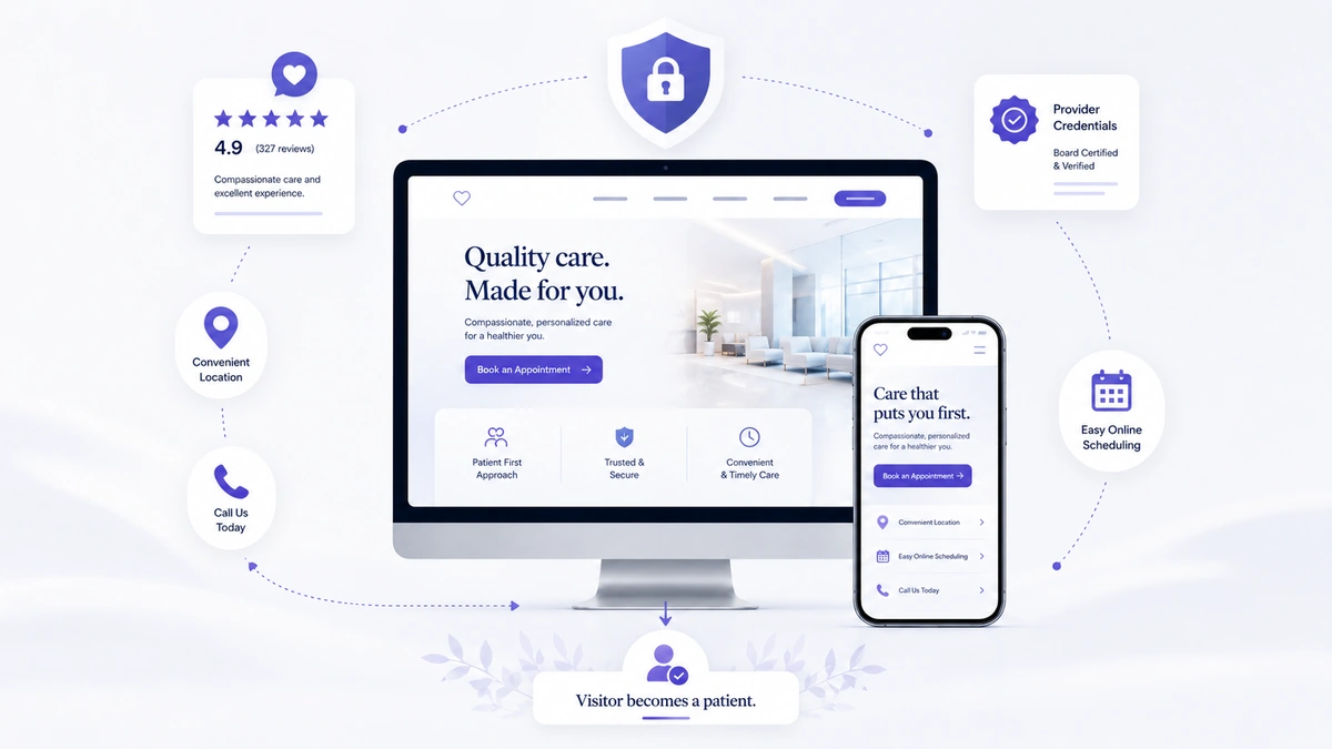
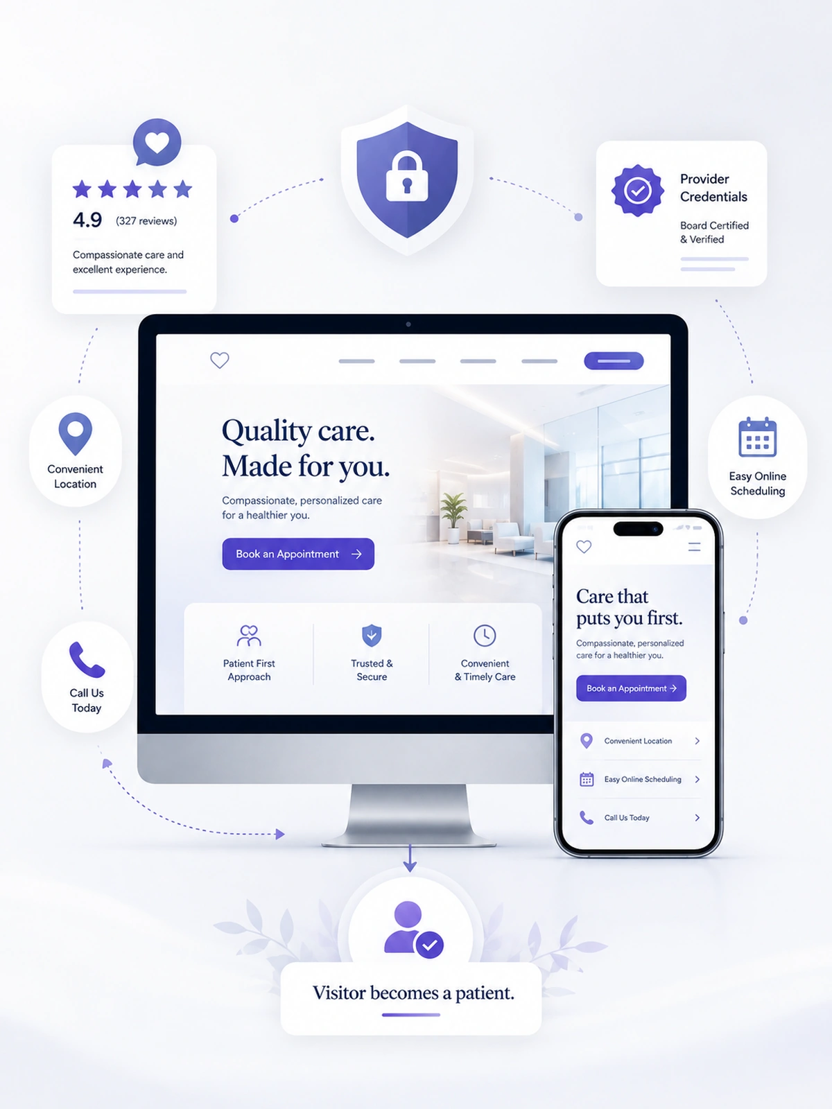
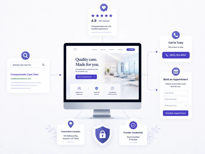
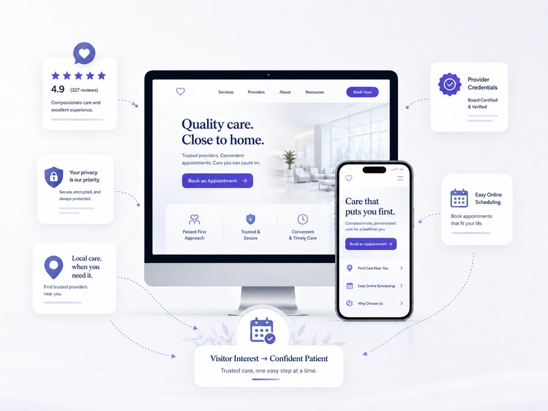
Healthcare landing pages convert visitors by reducing confusion, building trust, matching patient intent, and making the next appointment step simple to complete.

A healthcare landing page is often the bridge between interest and action. A patient may arrive after clicking a Google ad, searching for a nearby dentist, comparing urgent care options, reviewing cosmetic treatment, or looking for a chiropractor after weeks of discomfort. At that moment, the page must answer three basic questions quickly: Is this the right service? Can I trust this provider? What should I do next? If those answers are unclear, the visitor may leave before the practice ever knows there was interest.
Landing pages matter because healthcare decisions are personal, local, and often emotional. A visitor may be concerned about pain, cost, privacy, provider experience, or whether treatment is right for them. A strong landing page helps reduce that hesitation with patient-friendly copy, visible reviews, provider credibility, clear service information, and simple contact options. Review research continues to show how strongly trust signals influence decisions before contact, especially for local healthcare services.

Healthcare landing pages turn visitors into patients when they make the next step feel clear, safe, and relevant to the patient’s immediate concern.
— Vigorant Healthcare Marketing Team


Every section should help the visitor move from uncertainty to confidence before they call, book, or submit a form.
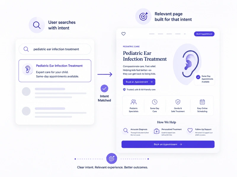
A landing page should match the exact reason a visitor arrived. If someone clicks an ad for dental implants, they should see dental implant information immediately. If they search for same-day urgent care, the page should highlight availability, conditions treated, and contact options. This intent match helps patients feel they are in the right place. It also improves lead quality because the visitor understands the service before contacting the practice.
Use service-specific pages for campaigns instead of sending all traffic to the homepage.


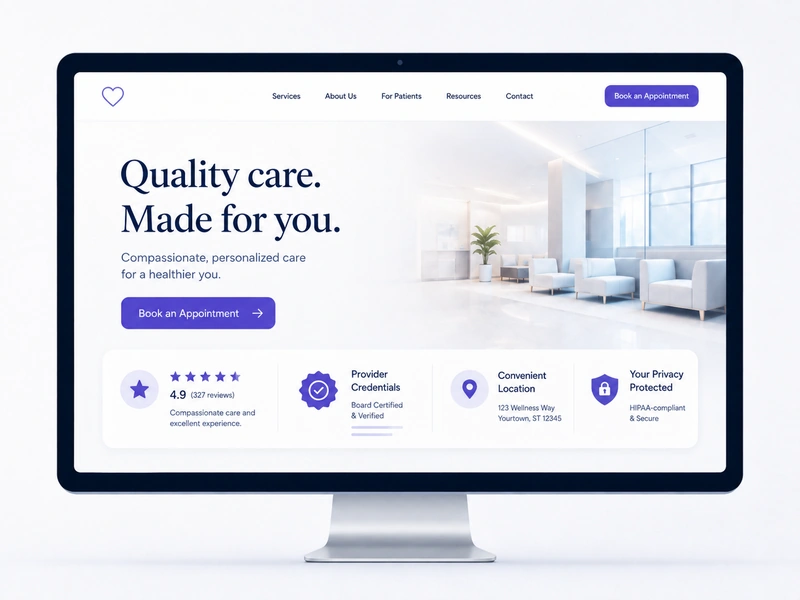
The first screen should quickly communicate credibility. This may include the provider name, service focus, location, review rating, appointment button, phone number, and a short benefit statement. Patients should not need to scroll deeply to understand whether the page is relevant. A strong above-the-fold section confirms the service, shows proof, and gives visitors a clear way to act. This early trust can keep visitors engaged long enough to become real patient inquiries.
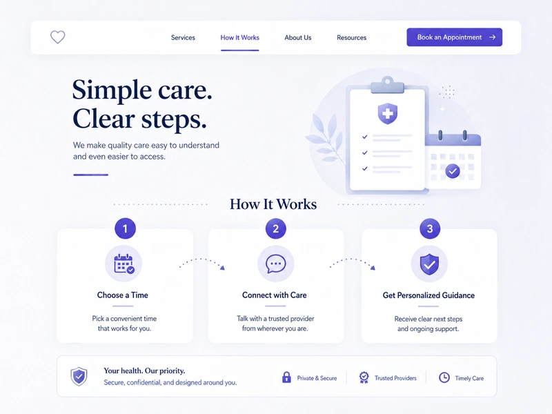
Healthcare copy should be accurate, but it should also be easy for patients to understand. Many visitors do not search using clinical language. They search for symptoms, goals, pain points, or convenience. A landing page should explain what the service helps with, who it may be for, and what the patient can expect next. Simple explanations reduce confusion and help visitors decide whether the practice is the right fit before they call.


Reviews, testimonials, credentials, technology notes, and provider experience should appear close to contact sections. When patients are deciding whether to submit a form or call, proof can reduce hesitation. Review research shows that consumers rely heavily on reviews when evaluating local businesses. For healthcare landing pages, proof should be real, relevant, and permission-aware, especially when patient stories or testimonials are involved.
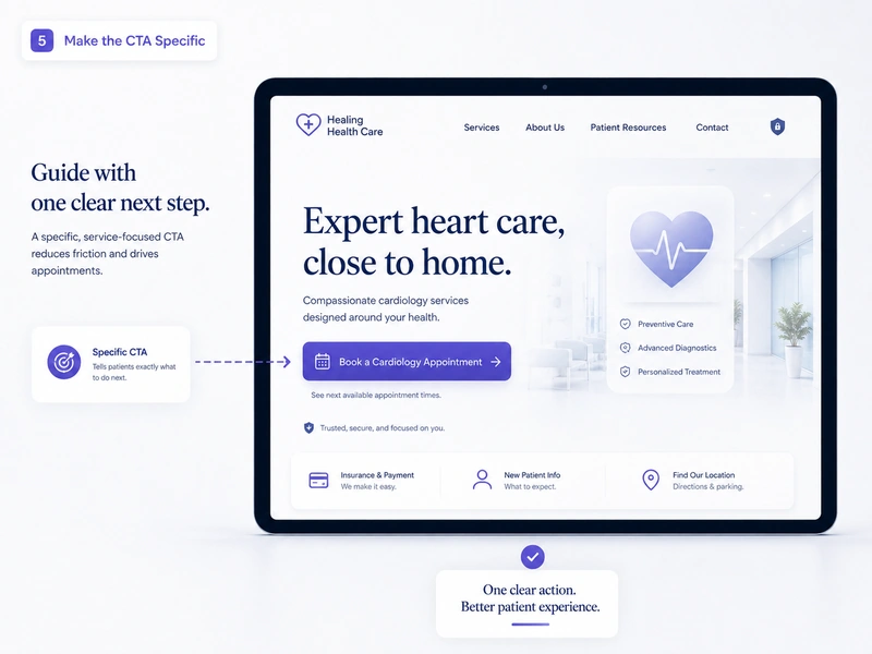
A generic button like 'Submit' does not tell patients what will happen next. A better CTA connects the action to the service and patient intent. Examples include 'Request an Implant Consultation,' 'Call for Same-Day Care,' or 'Schedule a New Patient Visit.' Specific CTAs help visitors feel more confident because they understand the purpose of the action. They also help the practice receive clearer, more qualified inquiries.


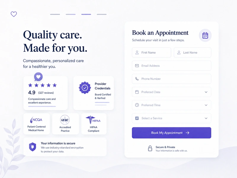
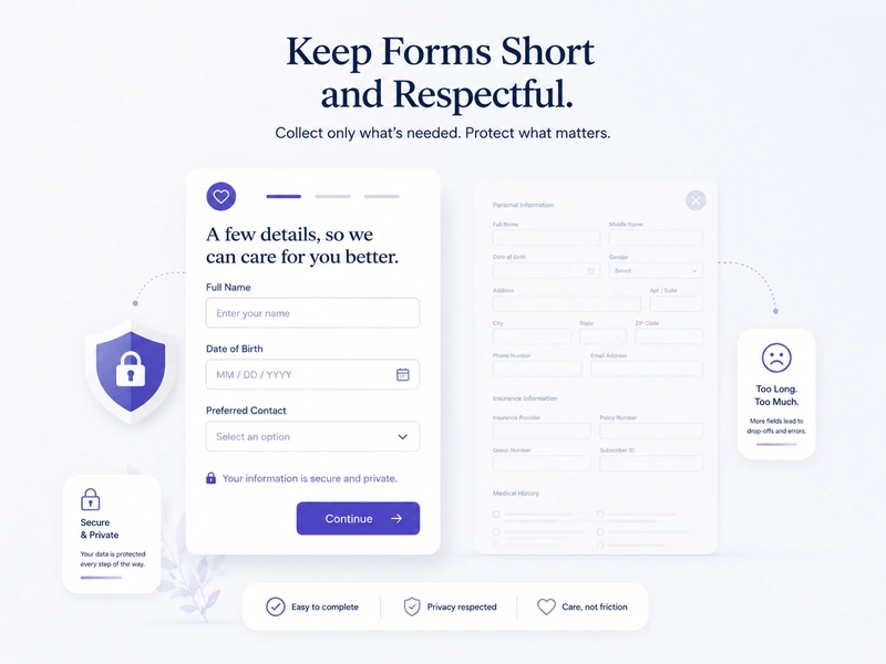
Healthcare forms should be easy to complete, especially on mobile. The first form should usually ask for basic contact details, service interest, and a short message, not excessive sensitive information. HHS guidance explains that HIPAA gives individuals control over how protected health information is used and disclosed for marketing, with written authorization generally required for marketing uses of PHI. This makes privacy-aware form planning important.
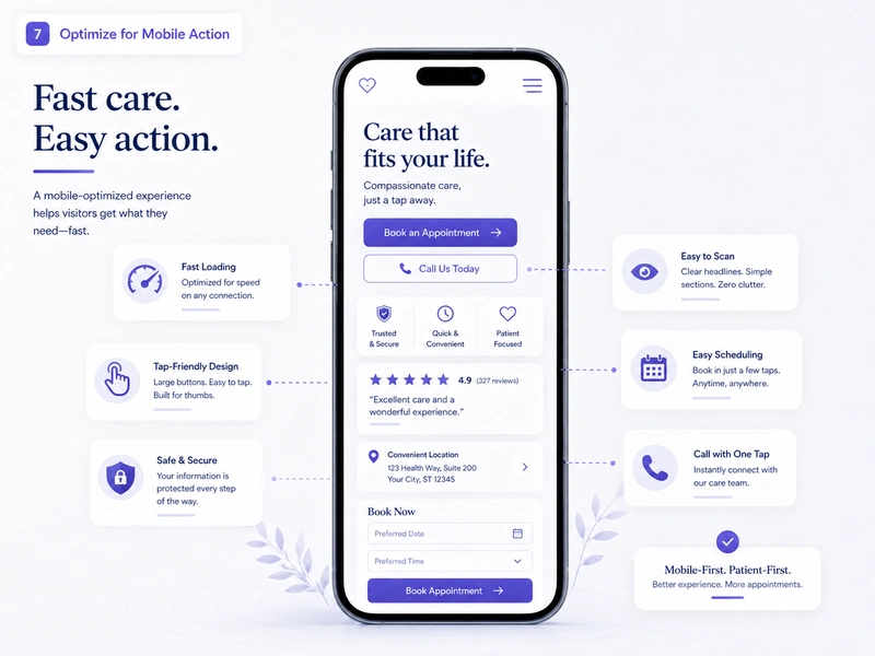
Many patient searches happen on smartphones, especially when the need is urgent or local. Google states that 53% of visits are likely to be abandoned if pages take longer than three seconds to load. A mobile landing page should load quickly, use readable text, offer tap-friendly buttons, and make phone numbers easy to find. When mobile action is simple, interested visitors are more likely to become calls, forms, or booked appointments.

A landing page should match the exact reason a visitor arrived. If someone clicks an ad for dental implants, they should see dental implant information immediately. If they search for same-day urgent care, the page should highlight availability, conditions treated, and contact options. This intent match helps patients feel they are in the right place. It also improves lead quality because the visitor understands the service before contacting the practice.
Use service-specific pages for campaigns instead of sending all traffic to the homepage.

The first screen should quickly communicate credibility. This may include the provider name, service focus, location, review rating, appointment button, phone number, and a short benefit statement. Patients should not need to scroll deeply to understand whether the page is relevant. A strong above-the-fold section confirms the service, shows proof, and gives visitors a clear way to act. This early trust can keep visitors engaged long enough to become real patient inquiries.

Healthcare copy should be accurate, but it should also be easy for patients to understand. Many visitors do not search using clinical language. They search for symptoms, goals, pain points, or convenience. A landing page should explain what the service helps with, who it may be for, and what the patient can expect next. Simple explanations reduce confusion and help visitors decide whether the practice is the right fit before they call.

Reviews, testimonials, credentials, technology notes, and provider experience should appear close to contact sections. When patients are deciding whether to submit a form or call, proof can reduce hesitation. Review research shows that consumers rely heavily on reviews when evaluating local businesses. For healthcare landing pages, proof should be real, relevant, and permission-aware, especially when patient stories or testimonials are involved.

A generic button like 'Submit' does not tell patients what will happen next. A better CTA connects the action to the service and patient intent. Examples include 'Request an Implant Consultation,' 'Call for Same-Day Care,' or 'Schedule a New Patient Visit.' Specific CTAs help visitors feel more confident because they understand the purpose of the action. They also help the practice receive clearer, more qualified inquiries.

Healthcare forms should be easy to complete, especially on mobile. The first form should usually ask for basic contact details, service interest, and a short message, not excessive sensitive information. HHS guidance explains that HIPAA gives individuals control over how protected health information is used and disclosed for marketing, with written authorization generally required for marketing uses of PHI. This makes privacy-aware form planning important.

Many patient searches happen on smartphones, especially when the need is urgent or local. Google states that 53% of visits are likely to be abandoned if pages take longer than three seconds to load. A mobile landing page should load quickly, use readable text, offer tap-friendly buttons, and make phone numbers easy to find. When mobile action is simple, interested visitors are more likely to become calls, forms, or booked appointments.

Conversion is not only about persuasive copy. In healthcare, conversion happens when clarity, trust, privacy, speed, and service relevance work together.
Healthcare landing pages should balance patient acquisition goals with accurate claims, privacy expectations, and realistic next steps.
Healthcare landing pages perform differently when every section is built around patient decision-making.
Hover or tap each card to flip
Broad and unclear
Matched to one service
Generic service phrase
Patient-focused concern
Hidden or missing
Visible above the fold
Not near CTA
Placed near decisions
Submit or Contact Us
Specific appointment action
Too long or vague
Short and useful
Hard to scan
Fast and tap-friendly
Clinical jargon
Simple patient language
Minimal location context
City and service-area clarity
More mixed inquiries
Better-fit patient leads
A landing page without strategy may still collect clicks, but it often leaves patients unsure. A conversion-focused healthcare page guides the right visitor toward the right action with less confusion and stronger trust.
Landing pages can improve conversions, but they cannot replace ethical messaging, real patient experience, or human review.
A landing page can present trust signals, but those signals must reflect the real practice. Fake reviews, stock-heavy visuals, exaggerated provider claims, or copied testimonials can damage credibility. Patients are more likely to act when the page reflects the actual provider, team, service experience, and office environment.
Healthcare landing pages should avoid promises that sound absolute or unrealistic. FTC guidance states that health-related advertising claims should be truthful, not misleading, and supported by appropriate evidence. Safer copy explains possible benefits, consultation-based recommendations, and realistic next steps.
Patients may hesitate if they feel their information is being collected without clear purpose. Landing pages should avoid asking for unnecessary sensitive details at the first conversion point. Form copy should explain what happens after submission and should be reviewed carefully when health information may be involved.
A landing page can generate strong patient interest, but the practice still needs fast follow-up, clear scheduling, and a front desk process that supports conversion. If calls go unanswered or forms are not followed up quickly, the page cannot do the entire job.
A landing page opens the door, but the patient experience determines whether interest becomes an appointment.
Patients are beginning to compare healthcare options through search engines, maps, review platforms, and AI assistants. A visitor may ask ChatGPT, Gemini, or Perplexity what to know before choosing a dentist, doctor, chiropractor, or urgent care provider. This means landing pages need to answer questions directly and organize information clearly enough for both humans and search systems to understand.
AI search visibility depends on structure, authority, and usefulness. Pages with clear FAQs, provider context, service-specific explanations, location details, and trustworthy references are easier to interpret. For healthcare practices, the goal is not only to appear in search. The stronger goal is to be seen as a credible option when patients compare services, providers, and next steps across multiple platforms.
Answer patient questions in clear, direct language
Add service-specific FAQ sections near page end
Include provider credentials and practice context
Use location details and service-area relevance
Keep health claims realistic and evidence-aware
Structure pages for patients and search systems

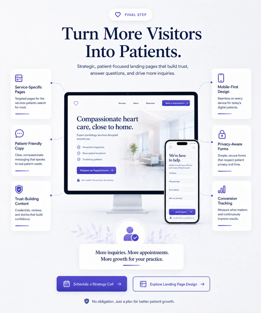
Vigorant builds healthcare landing pages around the full patient decision journey. For doctors, dentists, chiropractors, and healthcare practices, the goal is not only to make a page look professional. The goal is to help the right visitors understand the service, trust the provider, and take the next step with confidence.
Service-specific page strategy aligned with patient search intent and campaign goals
Patient-friendly copy that explains services clearly without unnecessary clinical complexity
Trust-building sections using reviews, credentials, process clarity, and provider context
Mobile-first layouts designed for fast scanning, tap-friendly buttons, and simple forms
Privacy-aware form planning that respects patient concerns and healthcare sensitivity
Conversion tracking for calls, forms, appointment requests, and qualified lead quality
These answers explain how landing pages help healthcare practices turn more visitors into serious patient inquiries.
A healthcare landing page is a focused webpage created for one service, campaign, or patient need. Unlike a general homepage, it guides visitors toward a specific action such as calling, requesting an appointment, or scheduling a consultation. For doctors, dentists, chiropractors, and clinics, a landing page should explain the service clearly, show trust signals, include provider or practice context, and make the next step easy. The best healthcare landing pages are built around patient questions, not only marketing goals.
Landing pages turn visitors into patients by reducing uncertainty. A strong page helps visitors understand the service, see whether the provider is trustworthy, confirm location relevance, and know what action to take next. It uses clear headlines, simple explanations, reviews, credentials, privacy-aware forms, and service-specific CTAs. When each section answers a patient concern, the visitor feels more confident calling or submitting a form. The conversion starts online, but it continues through timely follow-up and scheduling.
Service-specific landing pages are important because patients usually search with a specific need in mind. Someone looking for dental implants, urgent dental care, veneers, chiropractic back pain support, or primary care scheduling wants immediate relevance. A broad homepage may force them to search through unrelated information. A focused landing page confirms that they are in the right place, explains the service, and guides them toward one action. This improves both conversion rate and lead quality.
Healthcare landing pages should include trust signals such as provider credentials, real practice photos, review snippets, years of experience, technology details, comfort messaging, location information, and clear process steps. Trust signals are strongest when placed near CTAs, appointment forms, or major decision points. Patients often need reassurance before sharing contact information. Reviews and provider information help reduce hesitation, especially for higher-value or more personal services like implants, cosmetic dentistry, specialty care, or chiropractic treatment.
A healthcare landing page form should usually be short at the first point of contact. It may ask for name, phone, email, service interest, preferred contact method, and a brief message. The goal is to make follow-up possible without overwhelming the visitor. Practices should avoid asking for unnecessary sensitive information too early. More detailed information can be collected later through a secure intake process, phone conversation, or consultation. Short forms reduce friction and support stronger mobile conversion.
Mobile speed affects conversion because many patients search for care on smartphones. If a page takes too long to load, visitors may abandon it before reading the service information or contacting the practice. Google states that 53% of visits are likely to be abandoned if pages take longer than three seconds to load. Fast mobile pages, readable content, short forms, and tap-friendly buttons make it easier for patients to act in high-intent moments.
Yes. Dedicated landing pages can improve paid ad results because they continue the message that made the patient click. If an ad promotes emergency dentistry, the page should focus on emergency dental care. If an ad promotes implant consultations, the page should explain implant treatment and offer a consultation CTA. This message match reduces confusion and helps practices make better use of ad spend. It also improves tracking because calls, forms, and appointment requests can be tied to a specific campaign.
Vigorant helps healthcare practices improve landing pages through strategy, copywriting, design, SEO alignment, mobile usability, CTA refinement, form planning, and conversion tracking. The goal is to create pages that speak to real patient concerns, build trust quickly, and guide visitors toward meaningful action. For dental, medical, and chiropractic practices, Vigorant focuses on both conversion quality and patient experience, helping more website visitors become serious appointment opportunities.
Your website traffic only matters when visitors take the next step. Vigorant helps healthcare practices create landing pages that build trust, explain services clearly, simplify mobile action, and convert more interested visitors into patient inquiries. With the right strategy, every landing page can become a stronger patient acquisition tool.