
Web Design Trends to Watch
AI personalization, immersive 3D, voice UX, AR, and WCAG accessibility, which web design trends actually grow a healthcare practice, and which just look good?
June 24, 202611 min read
Read article 
The websites that win in 2025 are not just visually impressive, they are strategically designed to engage users, load fast, and convert visitors into customers. These are the trends shaping that outcome.
Every year, the world of website design and development evolves at a pace that challenges even experienced designers and business owners. The trends shaping today's web are not cosmetic choices, they are strategic decisions that directly affect how users engage with your brand, how quickly they trust you, and whether they convert into customers.
From the enduring power of minimalism to the growing demand for dark mode, voice interfaces, and sustainable design, the most successful websites in 2025 are those that balance modern aesthetics with user-centric functionality. Understanding which trends to adopt, and how to apply them purposefully, is the difference between a website that looks good and one that actually grows your business.
"Good website design is a language, not a style that comes and goes. The most effective design decisions are those rooted in how users think, behave, and make decisions, not in what happens to be fashionable."
Interaction Design Foundation, Web Design Principles

Each of these trends is actively influencing how leading websites are built, optimised, and experienced by users today.
Minimalism in web design is not a new concept, but it continues to dominate because it works. By removing unnecessary visual elements and focusing on what truly matters, clear navigation, strong calls to action, and fast load times, minimalist websites consistently outperform cluttered alternatives. Approximately 84.6% of visitors prefer a clean, uncluttered web layout. Minimalism also reduces page weight, which directly improves load speed and SEO performance. Crucially, minimalism does not mean sacrificing brand identity. When executed well, a stripped-back design makes a brand's core message more powerful, not less.
Minimalism works best when paired with intentional typography and strategic use of white space, not simply removing elements without purpose.


Once an optional feature, dark mode has become a mainstream web design standard. Presenting websites with a dark colour scheme, typically featuring light text and high-contrast elements, reduces eye strain, particularly for users browsing in low-light environments. On OLED screens, dark mode also conserves battery life by requiring less power to display dark pixels. Beyond the functional benefits, dark mode gives websites a modern, premium aesthetic that many users actively prefer. Offering a dark mode toggle is now considered a baseline user experience consideration for any professional website.
Neumorphism blends elements of skeuomorphism and flat design to create soft, three-dimensional UI components using subtle shadows and highlights. The result is a tactile, realistic appearance that makes interface elements feel as though they are raised from or pressed into the screen. This approach can enhance user engagement by making interactions feel more intuitive and physically grounded. Neumorphism also enables designers to establish clear visual hierarchy, directing user attention to specific elements through depth and contrast. It is best applied selectively to key UI components rather than as a full-site design system, particularly given accessibility considerations around contrast ratios.


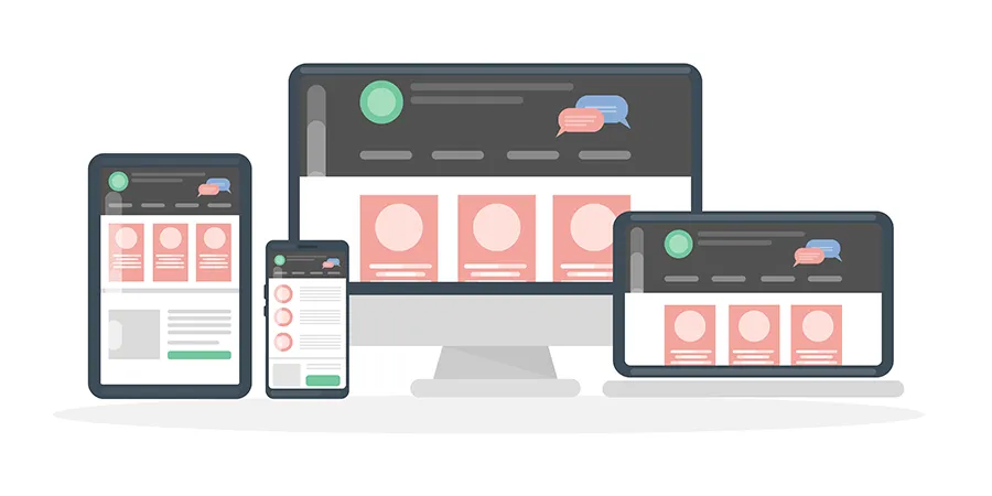
Mobile responsiveness is not a trend, it is the baseline requirement for any website built today. With over 55% of global web traffic originating from mobile devices and Google using mobile-first indexing, a website that does not perform flawlessly on smartphones is actively losing rankings and revenue. Approximately 62% of businesses report increased sales after implementing mobile-responsive web design. Beyond SEO, mobile-responsive design ensures that every user, regardless of device, receives a seamless, enjoyable experience. This directly reduces bounce rates, increases time on site, and improves conversion rates across all traffic sources.
Mobile responsiveness should be treated as a design foundation, not an afterthought. Every design decision should be evaluated on mobile first.
As environmental awareness grows among consumers and regulators alike, sustainable web design is emerging as both an ethical commitment and a competitive differentiator. Eco-friendly design practices include optimising images and code to reduce page weight, using green hosting providers powered by renewable energy, minimising unnecessary third-party scripts, and designing efficient page architectures that reduce server load. Sustainable design also tends to produce faster-loading, better-performing websites, making it simultaneously good for the environment and good for user experience. Brands that demonstrate a genuine commitment to sustainability through their digital presence build stronger trust with environmentally conscious audiences.
Explore Vigorant's Web Design Service →
Web designers are increasingly harnessing the emotional power of retro and vintage aesthetics to create memorable, distinctive digital experiences. Retro design elements, aged typography, muted colour palettes, textured backgrounds, and vintage illustration styles, evoke feelings of nostalgia, warmth, and authenticity that modern flat design often cannot replicate. In a crowded digital landscape, a well-executed retro aesthetic sets a brand apart and creates a strong emotional connection with users. Certain retro design elements also carry a timeless quality that keeps websites feeling relevant and appealing long after more trend-driven designs have dated. The key is applying retro elements with intention, as a brand expression, not a costume.
The voice recognition technology market is projected to reach $50 billion by 2029, and voice user interfaces (VUIs) are becoming an increasingly important dimension of web design. VUIs enable users to interact with websites using natural voice commands, improving accessibility for users with disabilities, providing a hands-free browsing experience for mobile users, and demonstrating a commitment to cutting-edge, inclusive design. As voice search continues to grow, websites that are structured to support voice queries, with conversational content, clear FAQ sections, and structured data markup, will gain a meaningful advantage in both traditional and AI-powered search results.


Typography has always been a powerful design tool, but oversized and experimental typefaces are now taking centre stage as a primary visual element, not just a supporting one. Large, bold, unconventional type choices instantly command attention, set the tone for a page, and communicate brand personality without a single image. Unique typography also strengthens brand recognition, becoming a distinctive visual signature that users associate with your identity. For accessibility, larger type improves readability for visually impaired users. The critical consideration is balance, oversized typography must align with your brand's personality and the overall design system. Excessive or inconsistent use can overwhelm users and undermine readability.
Micro-interactions are subtle animations or responses triggered by user actions, button hover effects, form validation feedback, loading indicators, scroll-triggered animations, and progress bars. While individually small, these design details have a significant cumulative impact on user experience. They provide immediate visual feedback that assures users their actions are recognised, guide users through processes intuitively, reduce frustration and uncertainty, and make a website feel responsive and alive. Micro-interactions can also be tailored to reinforce brand identity, creating a cohesive, personalised experience that distinguishes a professionally designed website from a generic template. When used purposefully, they are one of the most cost-effective ways to improve engagement and reduce bounce rates.

Minimalism in web design is not a new concept, but it continues to dominate because it works. By removing unnecessary visual elements and focusing on what truly matters, clear navigation, strong calls to action, and fast load times, minimalist websites consistently outperform cluttered alternatives. Approximately 84.6% of visitors prefer a clean, uncluttered web layout. Minimalism also reduces page weight, which directly improves load speed and SEO performance. Crucially, minimalism does not mean sacrificing brand identity. When executed well, a stripped-back design makes a brand's core message more powerful, not less.
Minimalism works best when paired with intentional typography and strategic use of white space, not simply removing elements without purpose.
Once an optional feature, dark mode has become a mainstream web design standard. Presenting websites with a dark colour scheme, typically featuring light text and high-contrast elements, reduces eye strain, particularly for users browsing in low-light environments. On OLED screens, dark mode also conserves battery life by requiring less power to display dark pixels. Beyond the functional benefits, dark mode gives websites a modern, premium aesthetic that many users actively prefer. Offering a dark mode toggle is now considered a baseline user experience consideration for any professional website.
Neumorphism blends elements of skeuomorphism and flat design to create soft, three-dimensional UI components using subtle shadows and highlights. The result is a tactile, realistic appearance that makes interface elements feel as though they are raised from or pressed into the screen. This approach can enhance user engagement by making interactions feel more intuitive and physically grounded. Neumorphism also enables designers to establish clear visual hierarchy, directing user attention to specific elements through depth and contrast. It is best applied selectively to key UI components rather than as a full-site design system, particularly given accessibility considerations around contrast ratios.
Mobile responsiveness is not a trend, it is the baseline requirement for any website built today. With over 55% of global web traffic originating from mobile devices and Google using mobile-first indexing, a website that does not perform flawlessly on smartphones is actively losing rankings and revenue. Approximately 62% of businesses report increased sales after implementing mobile-responsive web design. Beyond SEO, mobile-responsive design ensures that every user, regardless of device, receives a seamless, enjoyable experience. This directly reduces bounce rates, increases time on site, and improves conversion rates across all traffic sources.
Mobile responsiveness should be treated as a design foundation, not an afterthought. Every design decision should be evaluated on mobile first.
As environmental awareness grows among consumers and regulators alike, sustainable web design is emerging as both an ethical commitment and a competitive differentiator. Eco-friendly design practices include optimising images and code to reduce page weight, using green hosting providers powered by renewable energy, minimising unnecessary third-party scripts, and designing efficient page architectures that reduce server load. Sustainable design also tends to produce faster-loading, better-performing websites, making it simultaneously good for the environment and good for user experience. Brands that demonstrate a genuine commitment to sustainability through their digital presence build stronger trust with environmentally conscious audiences.
Explore Vigorant's Web Design Service →Web designers are increasingly harnessing the emotional power of retro and vintage aesthetics to create memorable, distinctive digital experiences. Retro design elements, aged typography, muted colour palettes, textured backgrounds, and vintage illustration styles, evoke feelings of nostalgia, warmth, and authenticity that modern flat design often cannot replicate. In a crowded digital landscape, a well-executed retro aesthetic sets a brand apart and creates a strong emotional connection with users. Certain retro design elements also carry a timeless quality that keeps websites feeling relevant and appealing long after more trend-driven designs have dated. The key is applying retro elements with intention, as a brand expression, not a costume.
The voice recognition technology market is projected to reach $50 billion by 2029, and voice user interfaces (VUIs) are becoming an increasingly important dimension of web design. VUIs enable users to interact with websites using natural voice commands, improving accessibility for users with disabilities, providing a hands-free browsing experience for mobile users, and demonstrating a commitment to cutting-edge, inclusive design. As voice search continues to grow, websites that are structured to support voice queries, with conversational content, clear FAQ sections, and structured data markup, will gain a meaningful advantage in both traditional and AI-powered search results.
Typography has always been a powerful design tool, but oversized and experimental typefaces are now taking centre stage as a primary visual element, not just a supporting one. Large, bold, unconventional type choices instantly command attention, set the tone for a page, and communicate brand personality without a single image. Unique typography also strengthens brand recognition, becoming a distinctive visual signature that users associate with your identity. For accessibility, larger type improves readability for visually impaired users. The critical consideration is balance, oversized typography must align with your brand's personality and the overall design system. Excessive or inconsistent use can overwhelm users and undermine readability.
Micro-interactions are subtle animations or responses triggered by user actions, button hover effects, form validation feedback, loading indicators, scroll-triggered animations, and progress bars. While individually small, these design details have a significant cumulative impact on user experience. They provide immediate visual feedback that assures users their actions are recognised, guide users through processes intuitively, reduce frustration and uncertainty, and make a website feel responsive and alive. Micro-interactions can also be tailored to reinforce brand identity, creating a cohesive, personalised experience that distinguishes a professionally designed website from a generic template. When used purposefully, they are one of the most cost-effective ways to improve engagement and reduce bounce rates.
"The web design world constantly evolves, with new trends that shape aesthetic styles and visual culture each year. The most enduring design decisions are those rooted in how users think, behave, and make decisions, not in what happens to be fashionable."
For authoritative guidance on web design principles and user experience research, see the Interaction Design Foundation's resource library linked in the footer of this page.
See how applying current web design trends changes every dimension of website performance and user experience.
Hover or tap each card to flip
Cluttered, element-heavy pages
Clean minimalist layouts with intentional white space
Light-only, single-mode design
Dark mode toggle with adaptive colour systems
Flat, generic button and form styles
Neumorphic depth and tactile interface elements
Desktop-first, scaled-down mobile
Mobile-first responsive design across all breakpoints
Unoptimised, high-energy page loads
Eco-friendly design with optimised assets and green hosting
Generic modern templates
Retro or typographic identity that differentiates
Keyboard and screen-reader gaps
Voice UI and inclusive design for all users
Standard body-size, safe typefaces
Oversized, expressive type as a primary design element
Static, unresponsive interactions
Micro-interactions providing instant visual confirmation
Heavy assets, slow load times
Optimised code and assets for sub-3-second loads
Weak mobile SEO signals
Mobile-first indexing compliance and structured data
Applying web design trends without a clear strategy can produce visually impressive websites that still fail to convert. The most effective approach combines trend awareness with conversion rate optimisation, ensuring every design decision serves both the user and the business goal.
Understanding these limits helps business owners make smarter web design investment decisions with realistic expectations.
Adopting every current design trend without a clear conversion strategy produces websites that look modern but fail to generate leads or revenue. Every design decision must be evaluated against your specific business goals, target audience, and competitive landscape, not just aesthetic preference.
The trust signals that convert a website visitor into a paying customer, genuine testimonials, authentic photography, clear value propositions, transparent pricing, and credible social proof, cannot be replaced by visual trends. Trust is built through content and credibility, not colour schemes.
A beautifully designed website with unclear messaging, thin content, or poor SEO architecture will still underperform. Web design and content strategy must work together. Strong design amplifies strong content, it cannot rescue weak copy or an unclear value proposition.
Pre-built templates and AI-generated website builders can produce visually acceptable results quickly, but they cannot deliver the custom SEO architecture, brand differentiation, conversion optimisation, and technical performance that a professionally designed website provides for a growing business.
"The web design world constantly evolves, with new trends that shape aesthetic styles and visual culture each year. The most enduring design decisions are those rooted in how users think, behave, and make decisions."
In 2025, a growing share of website-related searches begin on AI interfaces, not Google's standard results page. Users ask ChatGPT, Gemini, Perplexity, and Claude questions like 'What makes a good website design?' or 'Which web design agency should I use?' Whether your business is cited in those answers depends on how your website and content are structured.
Directly answers the exact questions users ask AI assistants about web design and your services
Verifiable credentials and professional affiliations cited on content pages to establish E-E-A-T
Organization, WebSite, FAQPage, and BlogPosting entities correctly implemented for AI indexing
Links to credible, non-commercial educational sources that validate your content claims
A consistent, expert-level library of content covering your core service areas in depth
Fast-loading, mobile-first, error-free website that AI crawlers and search engines can index completely
Vigorant is a growth marketing and website design agency. We apply current web design best practices, minimalism, mobile-first architecture, micro-interactions, performance optimisation, and more, within a conversion-focused strategy built specifically around your business goals and your target audience.
Custom websites engineered for user experience, SEO, and conversion performance
Mobile-first responsive design that performs across all devices and screen sizes
Conversion rate optimisation built into every design decision from the start
Fast-loading, technically optimised websites that rank and retain visitors
Brand-aligned typography, colour systems, and visual identity integration
Ongoing performance monitoring and iterative design improvement
Everything business owners and marketers need to know about web design trends, website performance, and choosing the right design approach.
The most impactful web design trends currently include minimalist layouts that reduce cognitive load, dark mode options that improve user comfort, mobile-first responsive design, micro-interactions that guide user behaviour, and eco-friendly design practices that reduce page weight and energy consumption. Each trend serves a functional purpose beyond aesthetics, improving load speed, accessibility, engagement, and conversion rates.
Yes. Minimalist web design removes visual clutter that distracts users from taking action. By focusing attention on key calls to action, reducing page load times, and simplifying navigation, minimalist websites consistently outperform cluttered designs in user satisfaction and conversion metrics. Research indicates that approximately 84.6% of visitors prefer a clean, uncluttered web layout over a visually complex one.
Dark mode has moved well beyond a passing trend. It is now a mainstream user expectation, particularly among mobile users who browse in low-light environments. On OLED screens, dark mode also reduces battery consumption. Offering a dark mode option improves user experience, reduces eye strain, and gives websites a modern, premium aesthetic that many users actively prefer.
Mobile devices account for the majority of global web traffic, and Google uses mobile-first indexing, meaning your mobile site performance directly determines your search rankings. A mobile-responsive design ensures your website displays correctly and functions smoothly across all screen sizes, improving user experience, reducing bounce rates, and supporting SEO performance. Approximately 62% of businesses report increased sales after implementing mobile-responsive web design.
Neumorphism is a design style that combines flat design and skeuomorphism to create soft, three-dimensional UI elements using subtle shadows and highlights. It creates a tactile, realistic feel that can improve user engagement. However, neumorphism is not universally suitable, it can create accessibility challenges for users with visual impairments if contrast ratios are insufficient. It works best when applied selectively to specific UI components rather than as a full-site design system.
Micro-interactions are small, purposeful animations or responses triggered by user actions, such as button hover effects, form validation feedback, loading indicators, or scroll-triggered animations. They improve user experience by providing immediate visual feedback, reducing uncertainty, guiding users through processes, and making interactions feel responsive and intuitive. Well-designed micro-interactions increase engagement and reduce user frustration without adding significant page weight.
Sustainable web design refers to practices that reduce the energy consumption and carbon footprint of a website. This includes optimising images and code to reduce file sizes, using green hosting providers powered by renewable energy, minimising unnecessary scripts and third-party requests, and designing efficient page architectures. Sustainable design also tends to produce faster-loading, better-performing websites, making it beneficial for both the environment and user experience.
Vigorant's website design and CRO service applies current web design best practices within a conversion-focused strategy tailored to your business goals. Rather than chasing trends for aesthetic reasons alone, Vigorant evaluates which design approaches, minimalism, dark mode, micro-interactions, mobile optimisation, and more, will deliver measurable improvements in user engagement, lead generation, and revenue for your specific audience and industry.
Vigorant is a growth marketing and website design agency serving businesses across the United States. We apply current web design best practices within a conversion-focused strategy built for your business, your audience, and your growth objectives.
AI personalization, immersive 3D, voice UX, AR, and WCAG accessibility, which web design trends actually grow a healthcare practice, and which just look good?
Discover why a strategic web design is essential for chiropractors in 2026. Learn how a well-built chiropractic website builds trust, ranks higher, and converts more visitors into booked patients.
The dental marketing trends that actually grow a practice in 2026, what mobile-first, video, automation, and AI search deliver, and where they need expert hands.