Why Mobile-First Design Decides If Patients Stay or Bounce
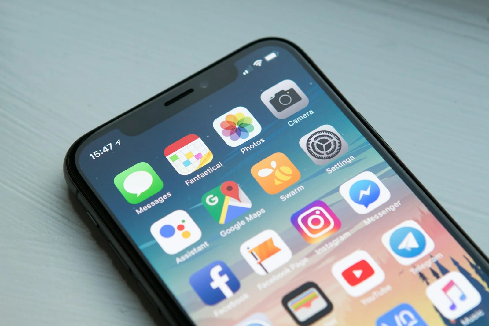
Most of your patients meet your practice on a phone first — mobile-first design decides in seconds whether they book, browse, or bounce.
What Mobile-First Design Actually Delivers
Designing for the smallest screen first forces clarity. It strips a site down to what patients truly need — and that discipline pays off on every device.
What Mobile-First Alone Can't Fix
A great mobile layout is necessary but not sufficient. The work that turns a mobile-friendly site into a patient-acquisition engine still takes strategy and expertise.
Google Now Judges Your Site by Its Mobile Version
Google has moved the entire web to mobile-first indexing, which means it predominantly uses the mobile version of a page for crawling, indexing, and ranking. In practice, your phone experience is your ranking — even for someone searching on a desktop. If your mobile site is slow, cluttered, or missing content that exists on desktop, that gap quietly caps your visibility.
This is why a mobile-friendly website is no longer a nice-to-have. For dental, medical, and chiropractic practices, where most patients begin their search on a phone, the mobile experience is the front door. A site that loads fast, reads clearly, and lets patients book without friction earns both stronger rankings and more appointments.
"Google predominantly uses the mobile version of a site's content for indexing and ranking. Make sure your mobile site contains the same content as your desktop site, and that it loads quickly for users on mobile devices."
Every Page Element, Honestly Evaluated for Mobile
Select an element below to see what mobile-first design gets right and where human strategy and review still make the difference for healthcare practices.
- Simplified menu structure
- Thumb-reachable key actions
- Sticky call & book buttons
- Reduced scroll depth
- Logical information architecture
- Patient-journey mapping
- Prioritising the right services
- Local-intent menu labelling
Key Pattern: Mobile-first design excels at clarity, speed, and usability on the device patients actually use. Human expertise handles strategy, compliance, accuracy, and the trust signals that turn visitors into booked patients.
Mobile-First and Responsive Design — You Need Both
These are not rivals. Mobile-first sets the priorities; responsive design delivers the flexibility. Together they create a site that performs on every screen.
The strongest websites use mobile-first as the foundation and responsive design as the framework that brings it to life.
Templates vs. Purpose-Built — The Honest Trade-Off
The gap between a responsive template and a purpose-built mobile-first website is not cosmetic. It directly affects how fast your pages load on a phone, how many patients finish booking, and whether your site ranks for the competitive local searches that bring new patients through the door.
Vigorant Website Design & CRO →The 4 Biggest Risks of Getting Mobile Design Wrong
These are not hypothetical. Each one quietly drains patients and rankings from practice websites every day — and each requires deliberate design and review to prevent.

The Model That Works: Mobile-First Foundation, Strategy-Led Build
The practices winning on mobile in 2026 don't choose between a clean layout and deep strategy. They start mobile-first and layer healthcare expertise on top.
"Designing for mobile first is a strategic decision, not just a technical one. It forces teams to focus on content and tasks that matter most to users — which improves the experience on every screen size."

Mobile-First Sites Are Easier for AI Search to Read and Cite
Patient behaviour is shifting from typing a query into Google toward asking an AI assistant for a recommendation. Increasingly, people ask ChatGPT, Google Gemini, Perplexity, Microsoft Copilot, and Claude where to find a provider, and these systems pull from content that is fast, accessible, and clearly structured.
A clean mobile-first site is naturally well-positioned for this. The same discipline that makes a page readable on a phone — concise structure, clear headings, fast loading, accessible markup — also makes it easier for AI engines to parse, trust, and cite your practice in their answers.
Your website is already on someone's phone right now — mobile-first design decides what happens next.
The practices that win on mobile in 2026 start mobile-first and build healthcare strategy on top — they don't treat a phone layout as an afterthought.
For dental, medical, and chiropractic practices, the stakes are higher than for general businesses. Your mobile site is the front door for booking, and it operates under accessibility and HIPAA-aware requirements that templates ignore.
Vigorant is a healthcare-exclusive growth marketing agency. We build mobile-first, strategy-led websites designed to load fast, rank well, and turn phone traffic into booked patients.
Frequently Asked Questions
Practical answers for dental, medical, and chiropractic practice owners on mobile-first design, mobile SEO, and turning phone traffic into appointments.
Mobile-first design is a strategy: you design the smallest-screen experience first — prioritising clean layouts, fast loading, and intuitive navigation — then scale up to tablet and desktop. Responsive design is the technical framework that lets a single layout fluidly adapt to different screen sizes. They are not competitors. Mobile-first sets the priorities; responsive design delivers the flexibility. The strongest healthcare websites use mobile-first as the foundation and responsive design as the framework that brings it to life across every device.
Yes. Google uses mobile-first indexing, which means it primarily crawls and ranks the mobile version of your site. If your mobile experience is slow, cluttered, or hard to navigate, it directly limits your search visibility — even for desktop searchers. Page speed and Core Web Vitals are part of how Google evaluates the experience, so a fast, well-structured mobile site supports both rankings and user engagement. No agency can guarantee a specific ranking, but mobile-first design removes the most common technical barriers to ranking well.
For most practices, the majority of patients first encounter the website on a phone — often while searching for urgent care, comparing providers, or trying to book an appointment on the go. If the site is hard to use on mobile, those patients leave and frequently do not return. A mobile-friendly website is no longer optional; it is the primary patient acquisition channel for dental, medical, and chiropractic practices.
A template can produce a mobile-responsive shell quickly, but responsiveness alone is not mobile-first. Templates rarely include HIPAA-aware forms, ADA/WCAG accessibility, condition-specific landing pages, healthcare SEO architecture, fast Core Web Vitals tuned for real mobile networks, or conversion paths designed around how patients actually book. For a practice relying on its website to grow, a purpose-built mobile-first design consistently outperforms a generic template.
Start with Google's Lighthouse and PageSpeed Insights to measure mobile performance and Core Web Vitals, and review the Page Experience report in Google Search Console. These tools surface slow loading, layout shift, tap-target spacing, and readability issues. Then test on real devices across different screen sizes and networks, because automated tools cannot catch every usability problem a real patient experiences.
The most common mistakes are cluttered layouts that overwhelm small screens, buttons that are too small or too close together to tap reliably, and text that requires zooming or has poor colour contrast. Each one hurts both usability and accessibility. The fix is to keep layouts clean, make CTAs large and well-spaced, and ensure legible fonts and sufficient contrast for all users, including those with visual impairments.
Page speed is central to mobile-first design because mobile users are often on slower networks and abandon sites that lag. Compressing images, reducing unnecessary elements, and aiming to load core content within the first few seconds keep visitors engaged. Core Web Vitals — loading, interactivity, and visual stability — are how Google quantifies that experience, and they influence both rankings and conversions.
Indirectly, yes. AI assistants like ChatGPT, Google Gemini, Perplexity, Microsoft Copilot, and Claude favour content that is fast, accessible, well-structured, and clearly authored. A clean mobile-first site with structured data, FAQ content, and named clinical authors is easier for these systems to parse and cite. Mobile-first design and Generative Engine Optimisation reinforce each other.