

 Blogs
Blogs
From digital strategy to design inspiration, our blog covers it all. Discover new ideas, advancements, practical advice, and stories that spark action.
Learn more about digital marketing in your field through our blogs


What Makes a Landing Page Convert Patients Into Appointments
Discover how landing pages convert patients. Learn proven strategies to increase appointments, trust, and leads for your clinic with Vigorant.
The $10K Mistake Most Dental Websites Make
Slow website speed and poor user experience are the hidden reasons most dental clinics lose patients before they ever book.

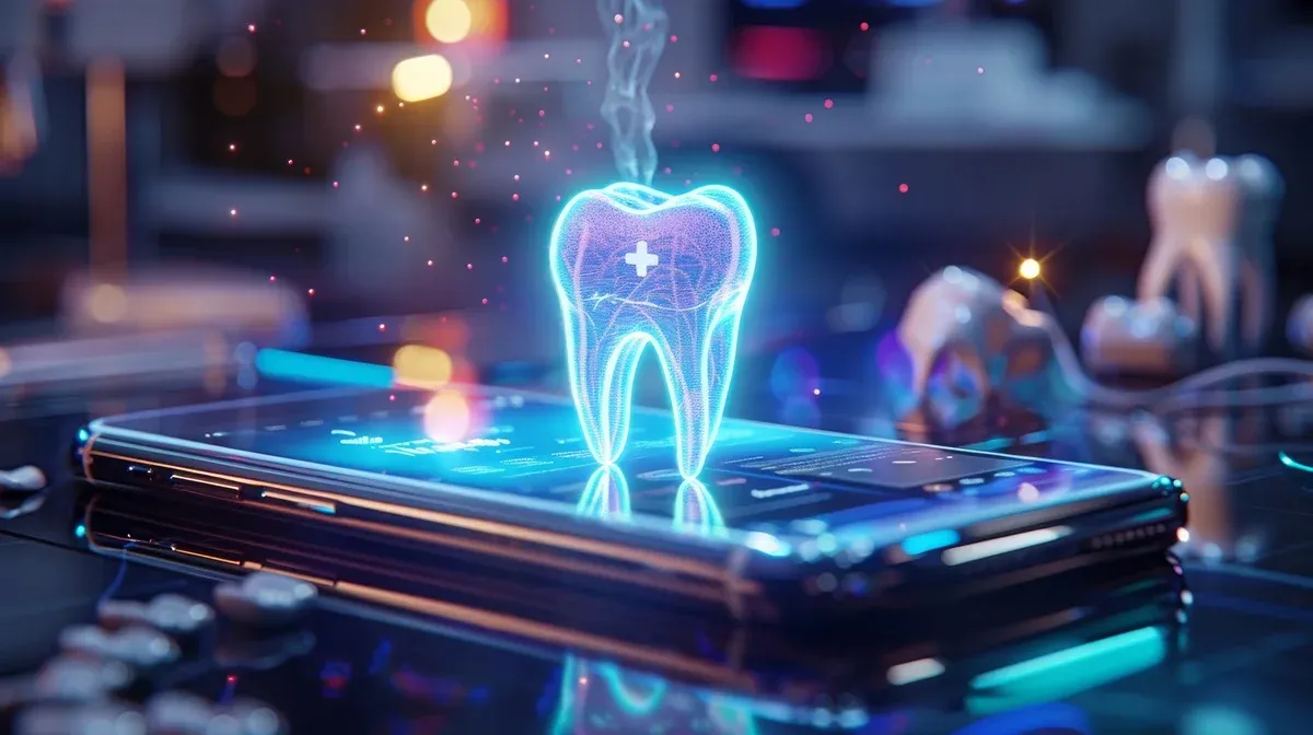
The Hidden Reason Your Website Isn’t Getting You Patients
Discover why your dental website is not converting visitors into patients and how fixing your system can create predictable growth and measurable appointments.

8 Green Marketing Practices for Sustainable Dental Growth in 2026
A practical guide to how green marketing strategies can help dental practices build trust, patient loyalty, and sustainable long-term growth in 2026 and beyond.

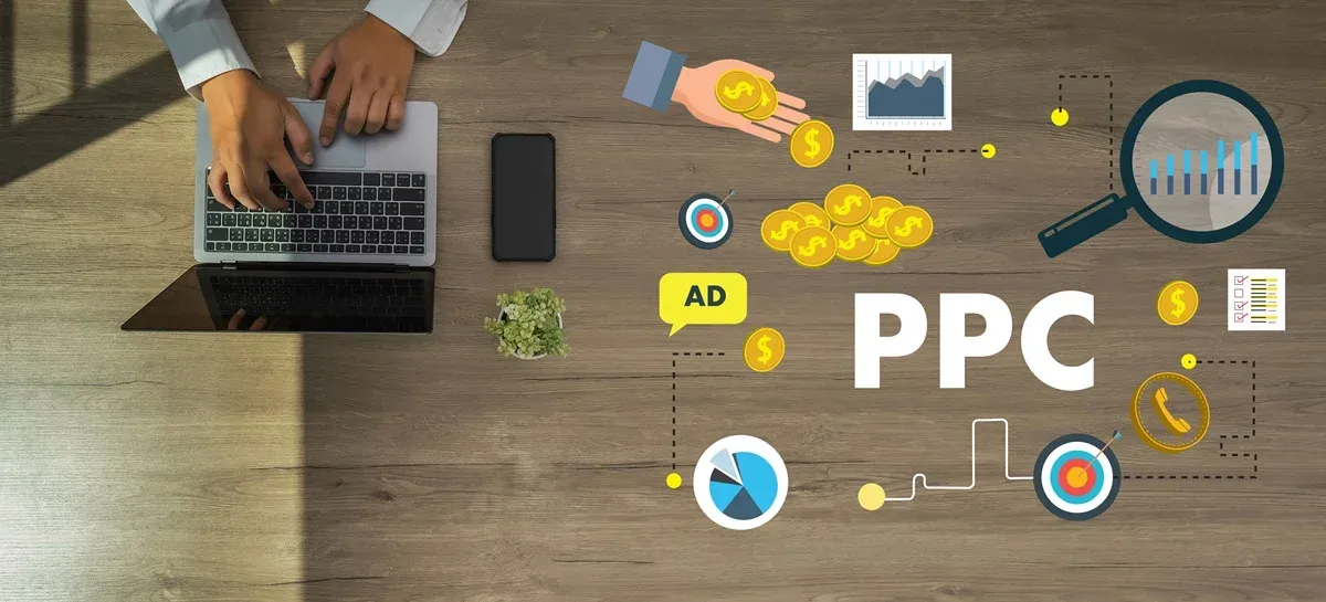
12 Smart Marketing Moves Dentists Are Making this Year
This blog explores smart, data-driven marketing strategies dentists are using to attract better patients and grow predictably.

10 Interactive Content Ideas That Boost Dental Marketing in 2026
Discover 10 interactive content ideas that boost patient engagement, educate visitors, and drive conversions for dental practices.

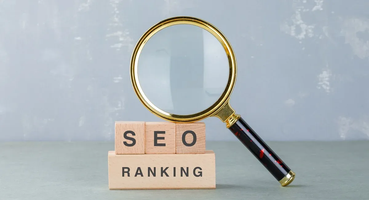
12 Reasons Patient Experience Now Drives Dental SEO Rankings
This blog elaborates how patient experience has become the core driver of dental SEO rankings, showing why engagement, trust, usability, and satisfaction now determine long-term search visibility and growth.

10 Data-Driven Marketing Insights for Dental Growth in 2026
Discover how data-driven insights, predictive analytics, and smarter attribution can help dental practices attract more patients, boost ROI, and achieve sustainable growth in 2026.